Pantone announced it’s 2012 color of the year recently as Tangerine Tango. Tangerine Tango (Pantone 17-1463), is an appealing reddish orange, and is to provide the energy boost we need to recharge and move forward. Currently, orange has grown in popularity and acceptance among designers and consumers alike. Orange is attention-getting, fun and lively.
“Sophisticated but at the same time dramatic and seductive, Tangerine Tango is an orange with a lot of depth to it,” said Leatrice Eiseman, executive director of the Pantone Color Institute®. “Reminiscent of the radiant shadings of a sunset, Tangerine Tango marries the vivaciousness and adrenaline rush of red with the friendliness and warmth of yellow, to form a high-visibility, magnetic hue that emanates heat and energy.”
So what does this mean when using color in design?
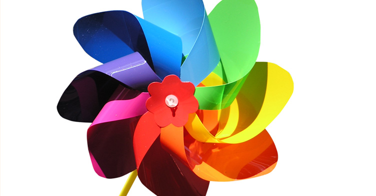
Effective use of color is all about relationships and communicating your brand’s message. Without spinning the color wheel to hard, there are some simple theories at work. Color has relationship values to other colors on the wheel. But the color wheel can be used or ignored and you could use color meaning instead. Just as design is subjective, color meaning and theory aren’t an exact science either. And if you ask several people, you get different answers as to what a particular color means, but one needs a starting point, so I’ve listed some accepted color meanings (source www.aboutlogodesign):
- Red evokes aggressiveness, passion, strength and vitality
- Pink evokes femininity, innocence, softness and health
- Orange evokes fun, cheeriness and warm exuberance
- Yellow evokes positivity, sunshine and cowardice
- Green evokes tranquility, health and freshness
- Blue evokes authority, dignity, security and faithfulness
- Purple evokes sophistication, spirituality, costliness, royalty and mystery
- Brown evokes utility, earthiness, woodsy-ness and subtle richness
- White evokes purity, truthfulness, being contemporary and refined
- Gray evokes somberness, authority, practicality and a corporate mentality
- Black evokes seriousness, distinctiveness, boldness and being classic
Remember, colors can have different meanings for different people – it’s all about context and your brand as a whole. As a designer considering and understanding the power of color and how to use it effectively for your brand’s goals are key to an overall good brand message. Discover the reason for color and use it your maximum advantage.


